What A Color Palette Brings To Home Design
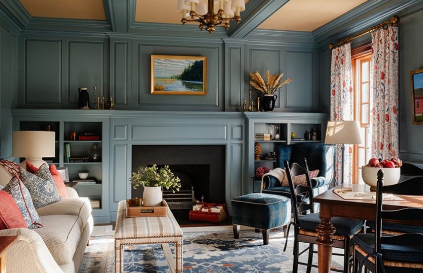
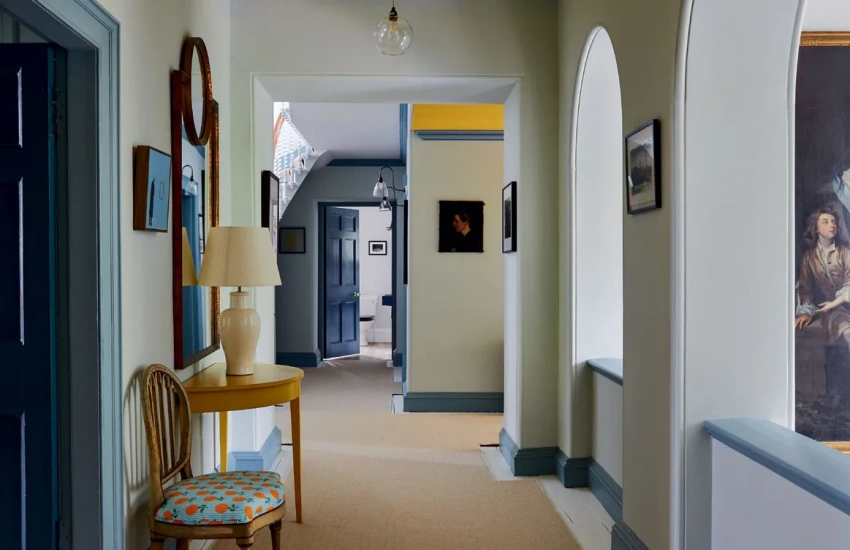
Choosing a color palette begins with understanding the emotional impact of colors. Warm tones like reds, oranges, and yellows can create a sense of energy and warmth, making them ideal for social spaces such as living rooms and kitchens. In contrast, cool tones like blues, greens, and purples tend to evoke calmness and tranquility, making them suitable for bedrooms and bathrooms. Considering the intended use of each room can guide color selection to enhance the desired atmosphere.
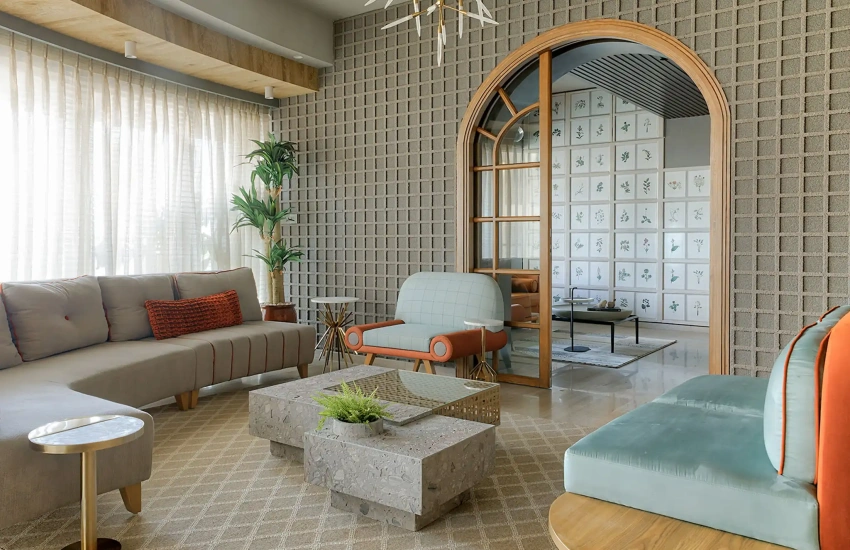
Establishing a base color is a crucial step in creating a cohesive color palette. This base color often serves as the foundation for the entire design scheme. Neutral shades such as whites, grays, and beiges work well as base colors, providing a versatile backdrop that allows other colors to shine. Once a base color is established, accent colors can be introduced to add depth and interest. These accents can be applied through furniture, artwork, or decorative accessories, allowing for flexibility in design.
Using the 60-30-10 rule can simplify the process of creating a balanced color palette. This guideline suggests that 60 percent of the room should be the dominant color, 30 percent should be a secondary color, and 10 percent should be an accent color. This approach ensures that no single color overwhelms the space while creating visual interest and harmony.
Incorporating textures and patterns can further enhance a color palette. Different materials can reflect and absorb light in various ways, affecting how colors appear in a room. Combining smooth surfaces with textured fabrics or patterned wallpapers adds depth and complexity to the overall design. When selecting patterns, it is essential to ensure they complement the chosen color palette, creating a cohesive look throughout the space.
Testing paint samples in different lighting conditions can help determine how a color will look throughout the day. Colors can shift in appearance depending on the time of day and the direction of light, making it vital to consider these factors when making selections. Rooms with ample natural light may benefit from bolder colors, while darker spaces might call for lighter shades to create a sense of openness.
Personal style should always be a consideration when choosing a color palette. Incorporating favorite colors or themes can make a space feel more personalized and inviting. Drawing inspiration from nature, art, or existing furnishings can help create a unique color scheme that resonates with individual tastes. Creating a mood board can assist in visualizing how different colors interact and can guide the final decision-making process.
Experimentation is key in finding the perfect color palette. Utilizing paint samples or fabric swatches allows for hands-on exploration of how colors work together. This trial-and-error approach can lead to unexpected and delightful combinations that enhance the beauty of a home. By understanding the principles of color theory and applying them thoughtfully, homeowners can create spaces that are not only visually appealing but also reflective of their personality and lifestyle.